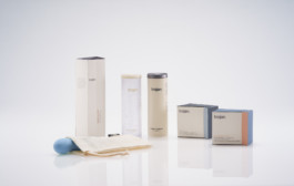
Trojan
Packaging. Branding.
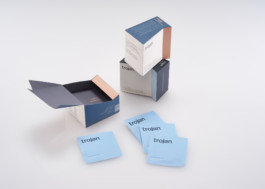
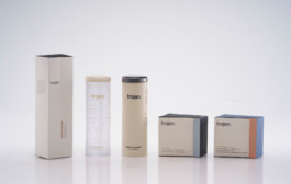
Trojan is one of the largest and most recognized condom brands on the market. Their current design is overwhelming loud and indiscreet, I created a form system that would maintain discretion and complement the everyday lifestyle. The redesign of Trojan is gender-neutral in its form to communicate the candid nature of intimacy and to represent a duality of femininity and masculinity.


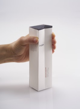
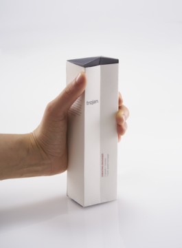
Form Inspiration
The form embodies an architectural structure of masculinity and is complemented with rounded curves of elegance.