

Sabre
Packaging. Branding.
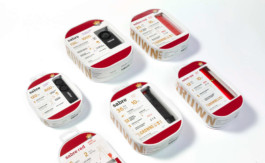
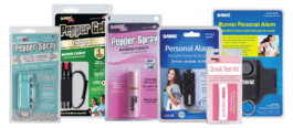
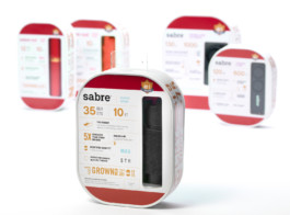
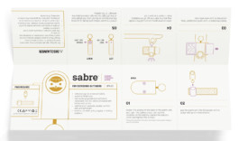
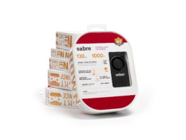
Sabre is a pepper spray manufacturing corporation that is known for its personal safety products. With a vast range of products that are used by both law enforcement and the everday person; Sabre's current identity struggles to communicate to their primary consumer base: females, ages 18-40. The redesign of Sabre's packaging establishes a typographic hierarchy of the essential product information and incorporates illustrations to convey the product's ease of use.

Current Logo
The current logo is authoritative, masculine, and dated.
New Logo
The redesigned logotype is neutral, approachable, and appeals to a more inclusive range of consumers. The modified letterforms are inspired by Rockwell and Akkurat. The logo is gender neutral, friendly, and approachable.
Before
After
Form Inspiration
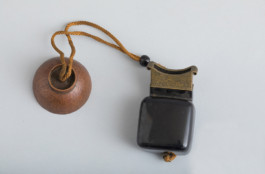
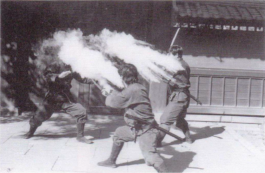
The rounded and rectangular form was inspired by the metsubushi, which was a pepper powder encasing that was used by ninjas in feudal Japan.
Color Inspiration
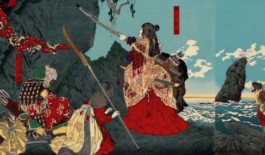
The red, eggshell, and gold color palette is inspired by the Onna-Bugeisha, who were Japanese female warriors in feudal Japan. The colors represent strength, female empowerment, and fearlessness.
Instruction Insert
© Diana Huang 2021